This weekend we trucked out to Lucketts to check out their Spring Design House. Their “vintage hip” farmhouse style never disappoints. We absolutely love seeing what the amazing team puts together each season. The fun thing about this unique experience is that you can shop directly from the interior design house as your walking through. Look how pretty that centerpiece looks…. load it in your bag. I love that throw pillow they used on the couch, snag it and keep walking. It’s so much fun and a little dangerous 😉 We snapped some photos to share some of their spring design inspiration with you. I wish I had taken more photos, but my hands were full by the end of our visit. 🙂

If you are ever in the DC, MD, Northern VA area and have some free time, you should definitely check out Lucketts. Check their website for special events, like their design house and flea market weekends. It really is amazing to see how the same house can look so different each time we visit.
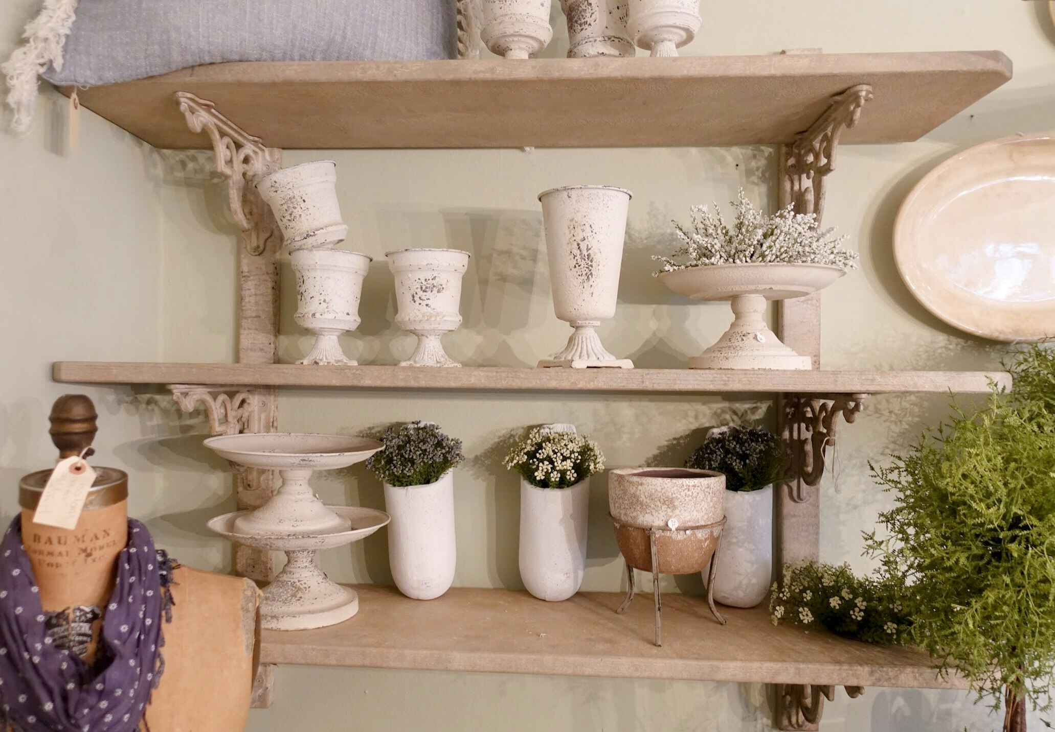
We saw room after room of faux flowers and greenery. Michaels stores have a wide selection of faux flowers and greenery right now as well. The Hearth and Hand collection at Target also has some pretty options for vase fillers like this eucalyptus sprig You can see our post here on some ideas on how to incorporate faux plants into your home. I loved these little vases with small sprigs of flowers. I snagged three of the antiqued white vases for our mantle, two shorter ones and one of the taller ones. 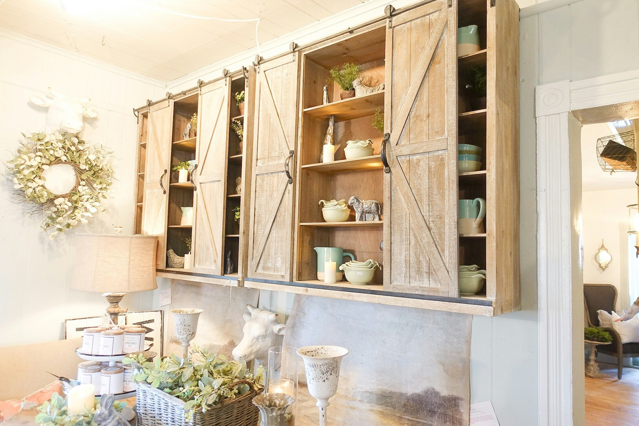
How gorgeous are these barndoor cabinets doors? EEEEE! I love them as kitchen cabinet doors they would also look amazing on a built-in bookshelf or over the tv in our family room to brighten up the room with the tv isn’t in use.
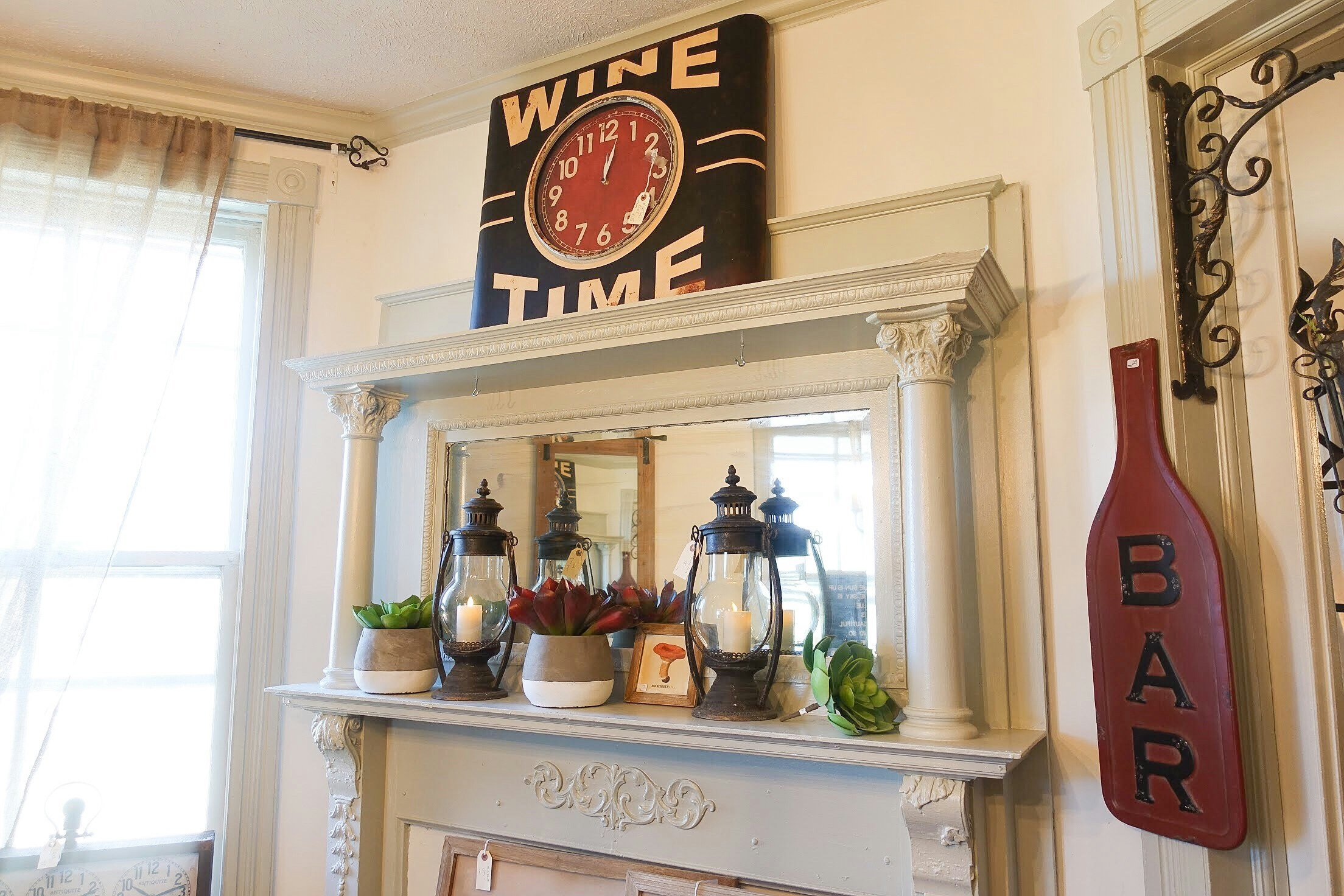
I wish I had a space for this wine time clock! Isn’t it great?
I love this simple mantle design. The tall lanterns add height and the faux succulents and a pop of color. The two-toned vases that hold the succulents help tie in the warm brown tones of the lanterns and the brighter cream color of the mantle.
We have seen some similar succulent stems at Michaels and Target.
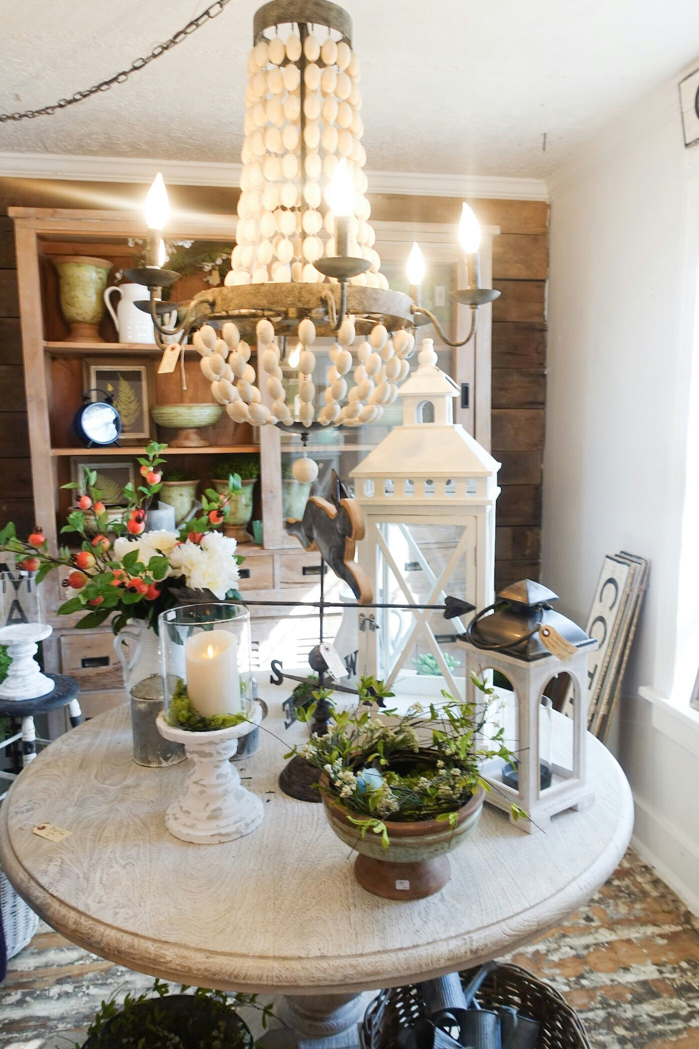
First, the wooden bead chandelier. I’ve seriously been looking at the house today as to which light I can take down and replace with this beauty. I found a similar one here if ya’ll love it as much as I do.
Notice the lanterns on the table. We saw a lot of different lanterns used as centerpieces and mantle decorations. We found some similar ones at Michaels, Target and at Walmart.
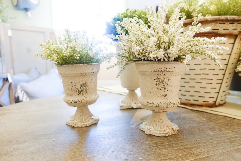
Aren’t these perfect?! All three of these came home with me after taking this picture. Similar faux flowers can be found at Michaels. I’m still searching for similar vases for those of you too far from Lucketts.
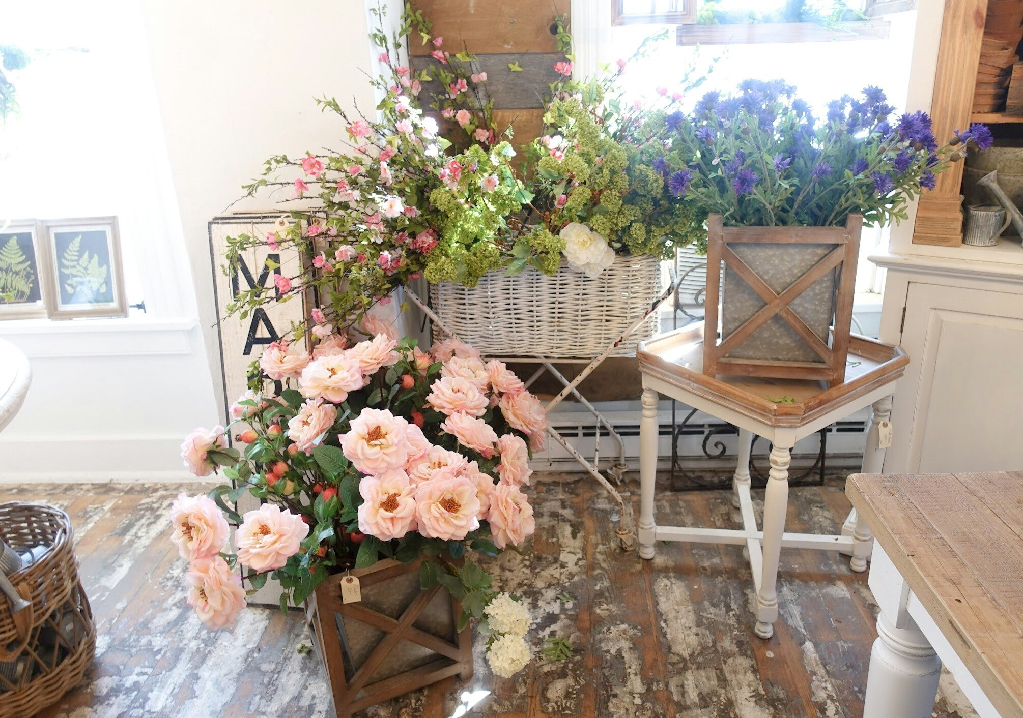
I seriously might be driving back to snag these wood and galvanized metal containers. I love how they filled them with bunches of faux flowers and greenery to mimic a container garden. It looked gorgeous and would be a hassle-free way to add more color and texture to your Spring decor.
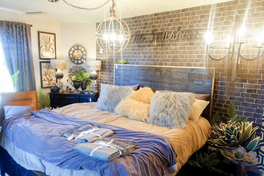
There is literally so much to take in when you step into one of the rooms in the design house. I love the way they used a wall covering to mimic a brick focal wall. We found a few similar option here.
The headboard is so similar to the one I want to snag for my son’s room here. I love the reclaimed wood with metal trim.
I’m so sad that I didn’t notice the “hello sunshine” sign until now! I love how subtle it is on the accent wall and would be a fun addition to a kid’s bedroom design or on a smaller scale against a bright white bathroom.
Also, their faux ferns were used multiple times throughout the house. Again, a perfect way to bring color and texture into any room.
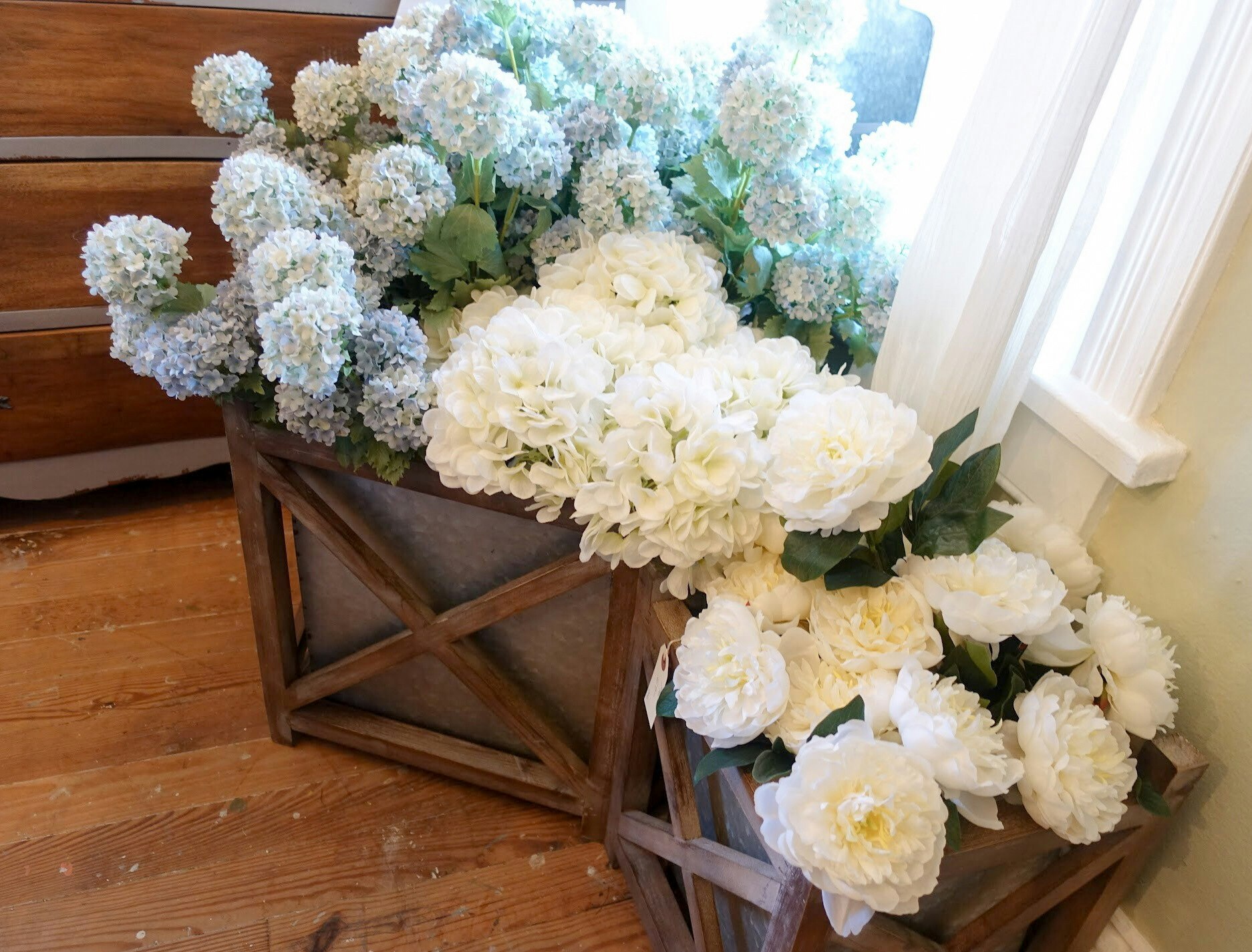
How gorgeous do these planters look with all of these cheery faux flowers?
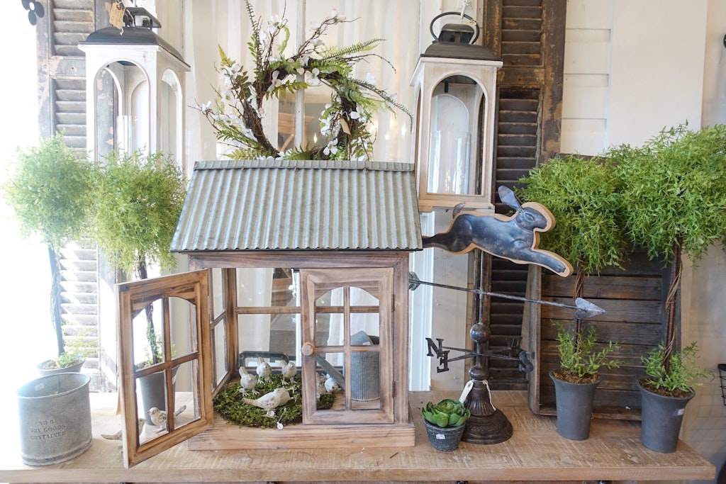
Another find that I’m sad that I didn’t snag, these topiaries are a perfect way to add height and color to your mantel, sofa table or entry table.
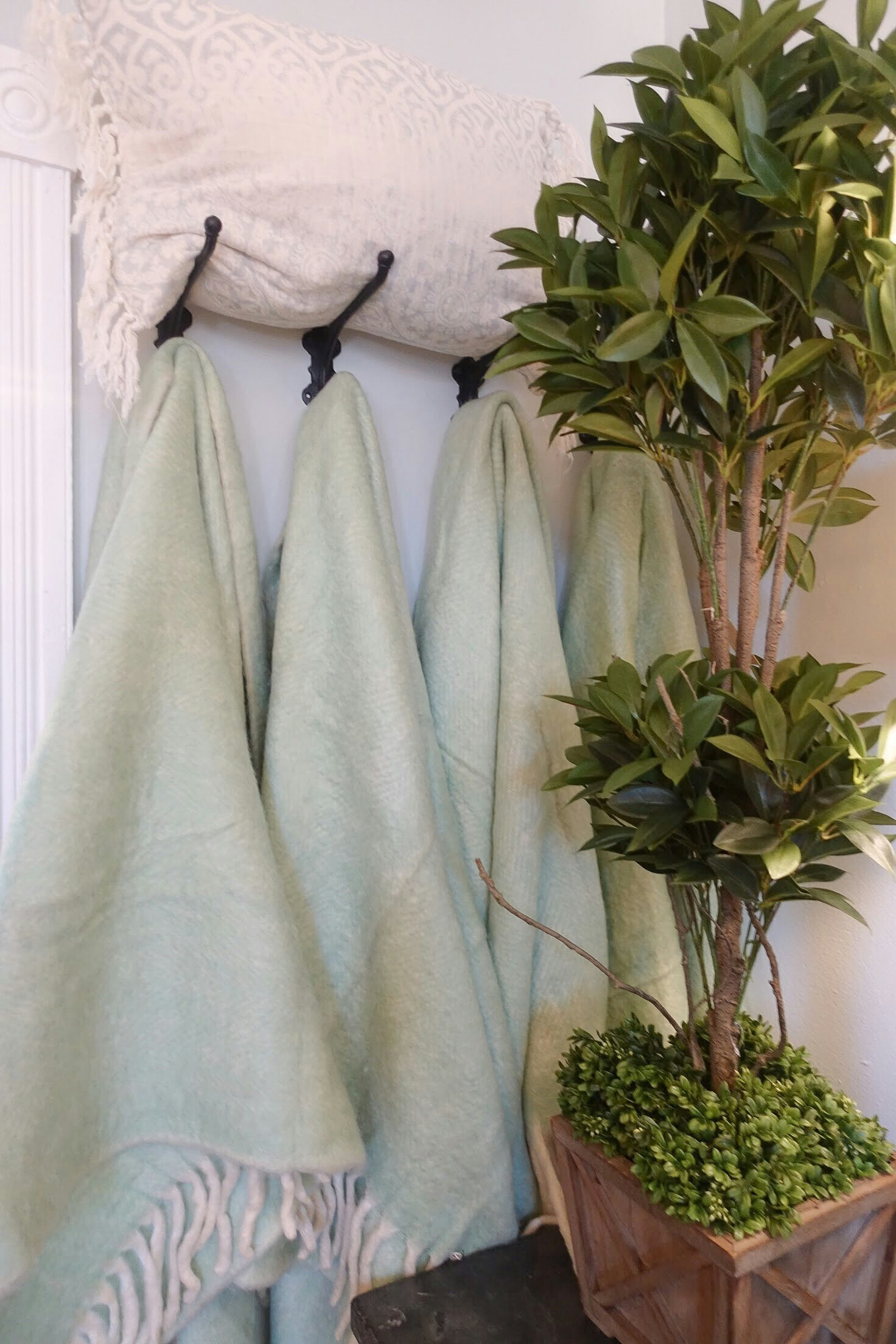
Multiple rooms throughout the design house had hooks displaying colorful throws.
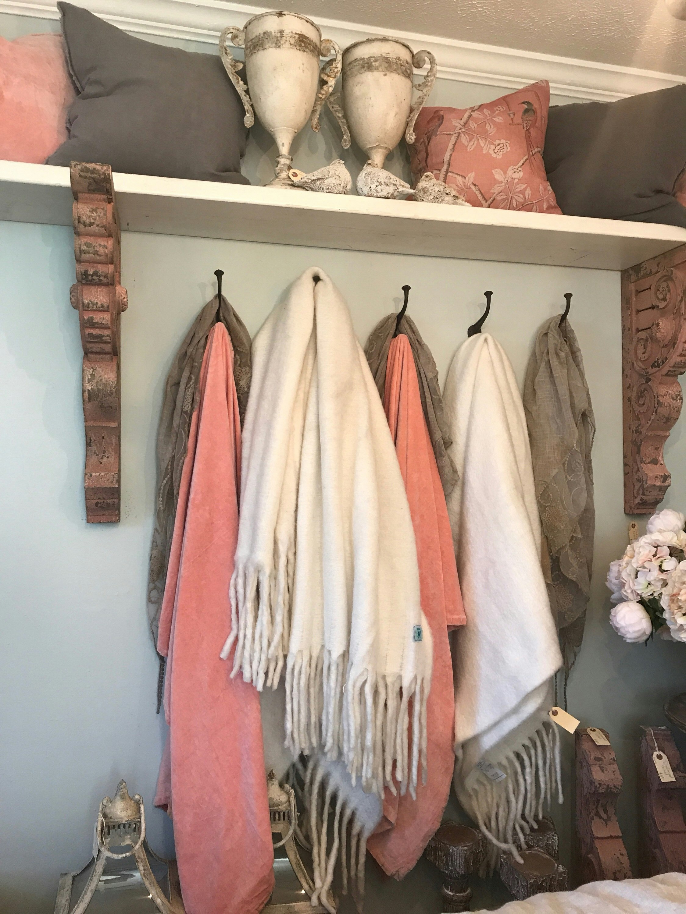
If you have a nook in your family room or bedroom this would be a fun way to add a soft pop of color.
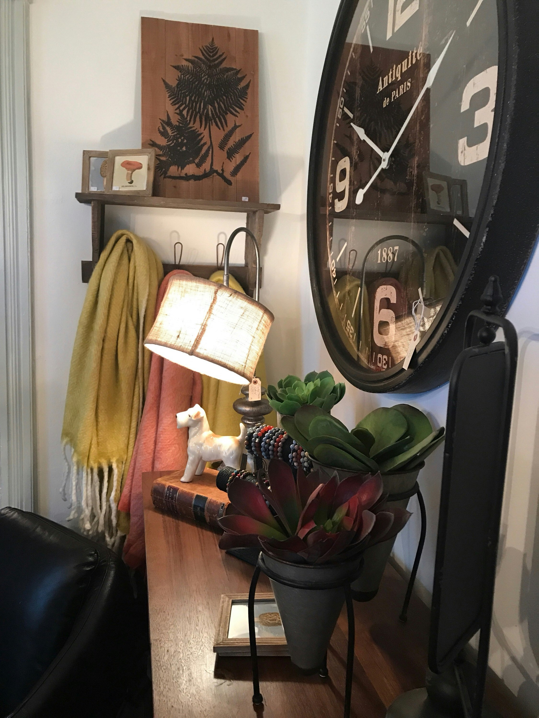
Don’t choose anything too busy, one or two solid colors or something with a muted pattern. Every space is different, I just loved how this added color and texture to an otherwise flat wall.
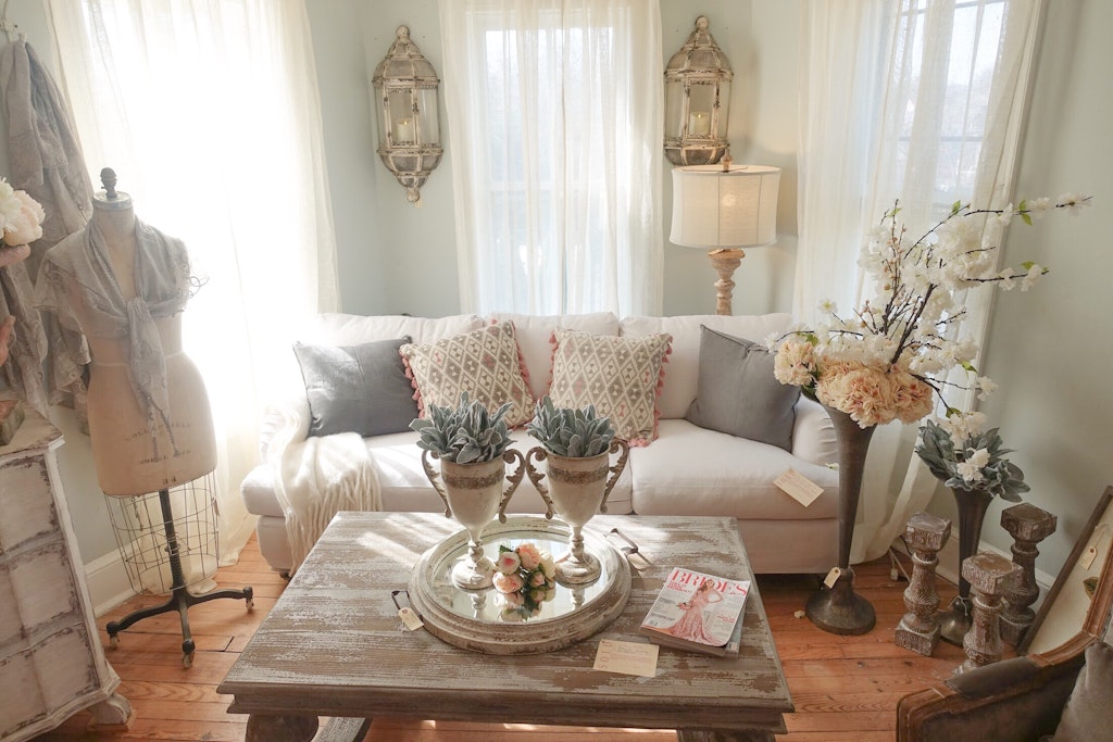
A simple mirrored tray in the center of the coffee table holds vases with faux greenery.
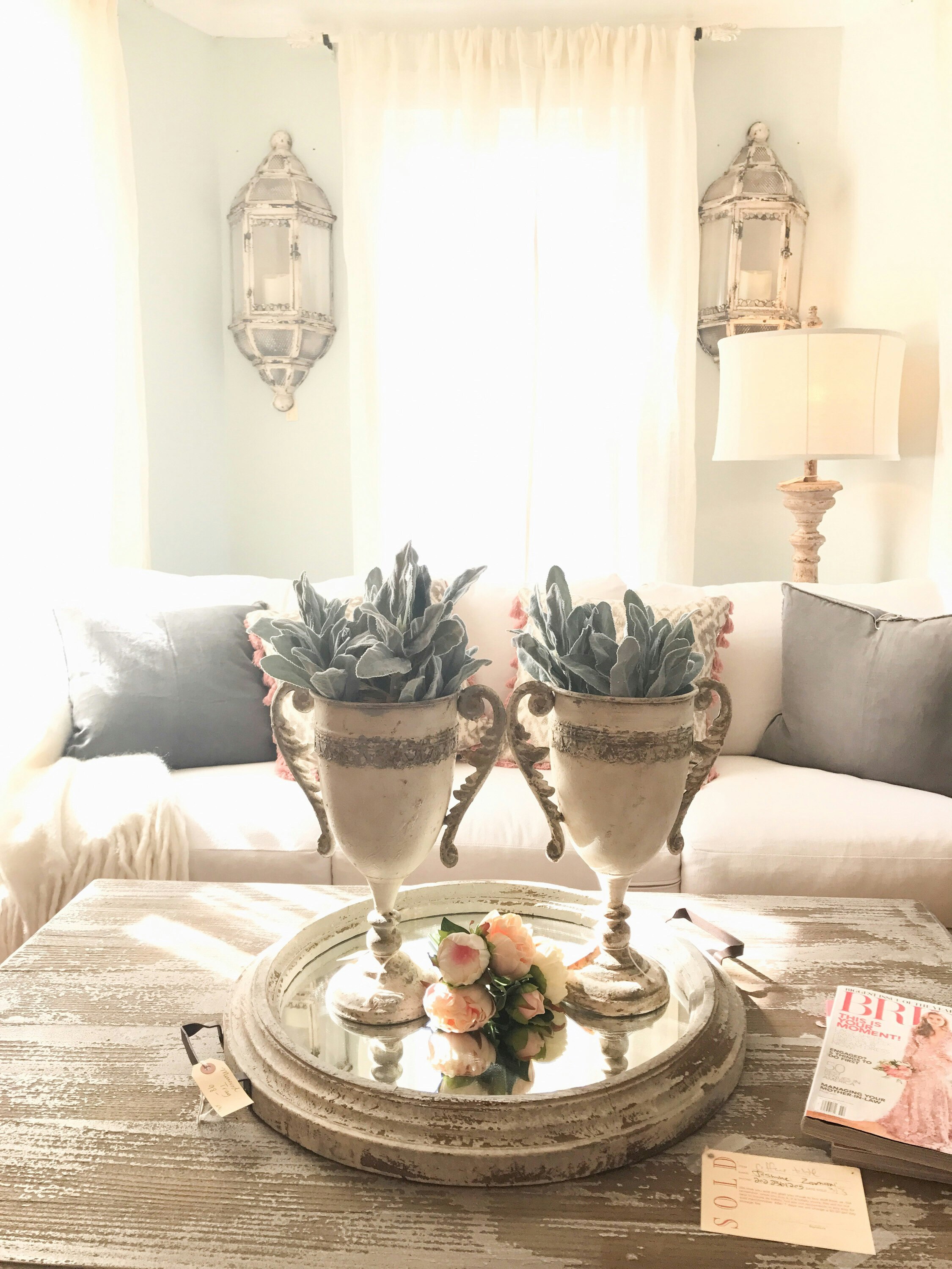
The lanterns mounted on the wall add light and interest to tight spaces in between the windows.
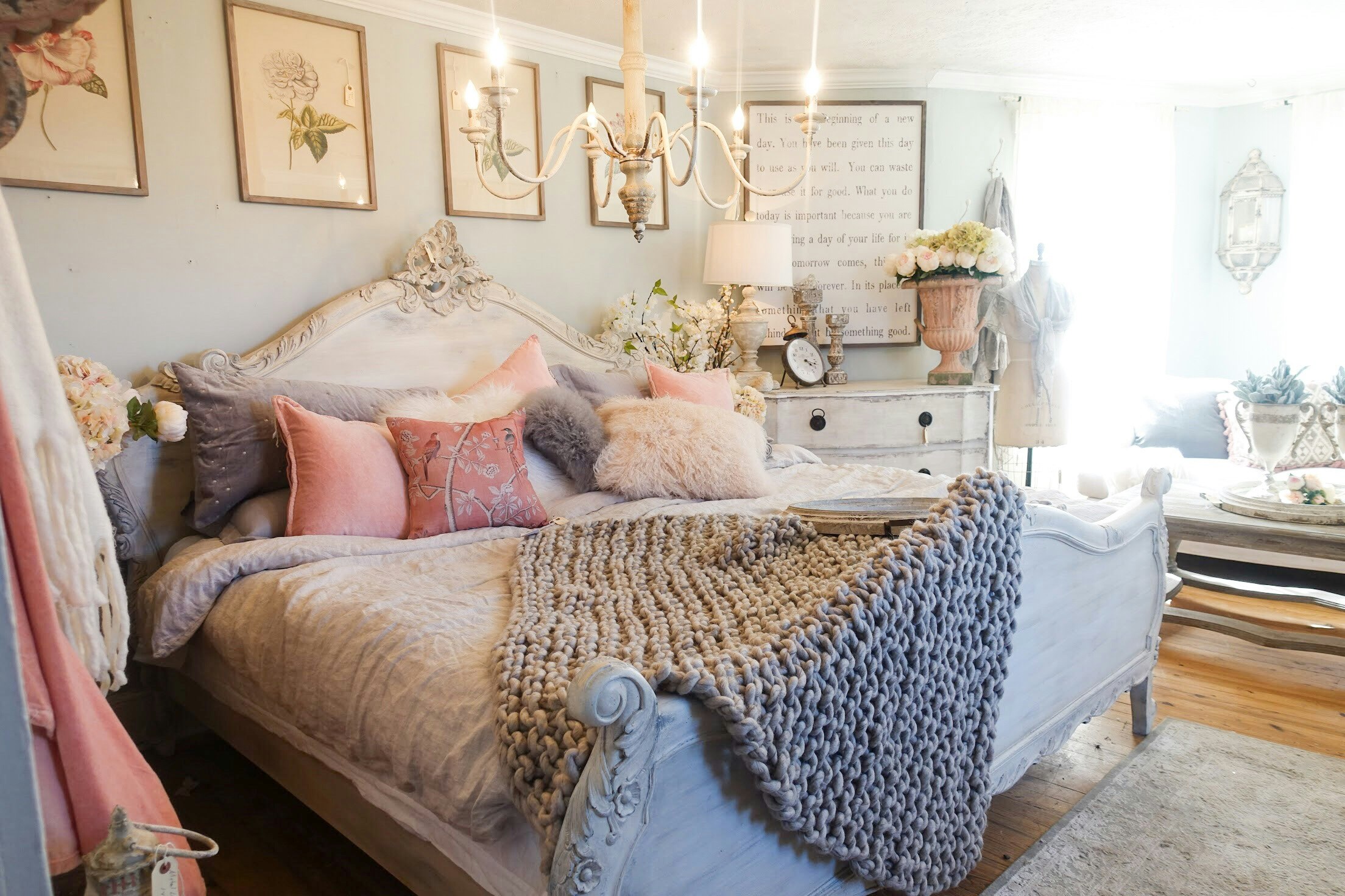
Isn’t this bedroom yummy? I love how they used just a few similar colors with different textures to create this look.
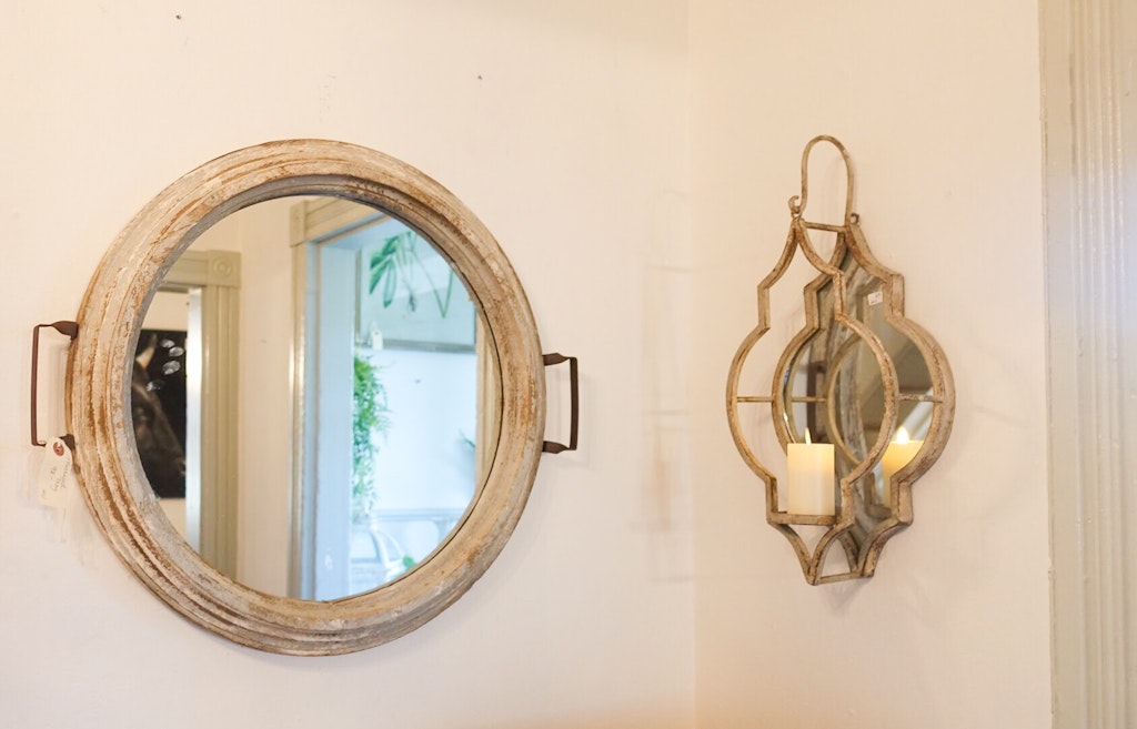
This same tray that they used as a centerpiece to the coffee table was also displayed as a wall hanging. I can’t decide which way i like it better… is both an option? 🙂
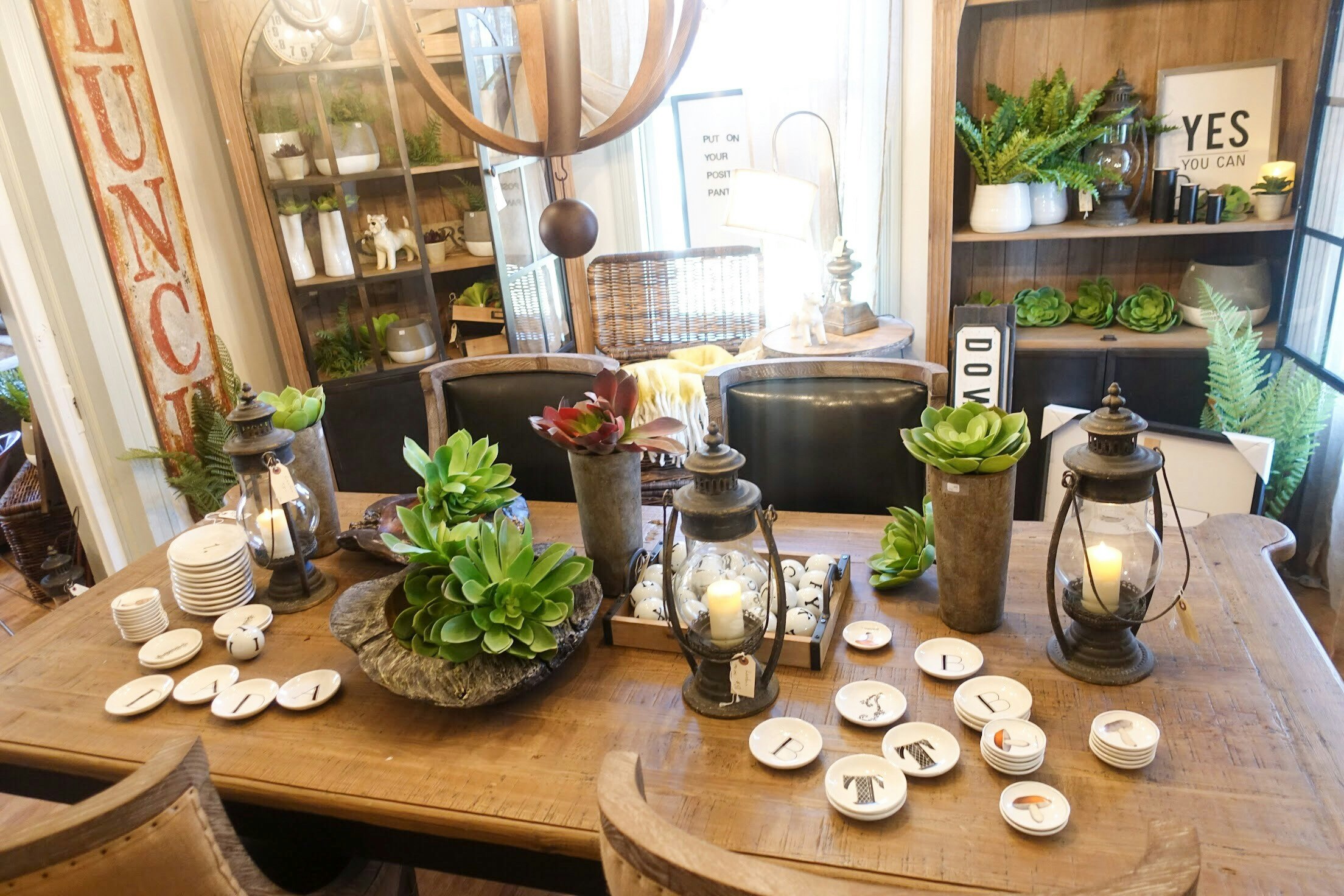
There are so many things I love about this shot, but I think my favorite is the vintage kerosene lamps being used as decorative candle holder centerpieces. I sure hope they still have those at the next design house because they are coming home with momma. 🙂
I hope you were inspired to add some new touches to your Spring decor!
